Will operators of multiple short-term lets be deterred by registering each property separately?
What we tried to achieve
We wanted to find out whether people who owned and operated multiple short-term lets would be put off registering if they had to register each property separately. We wanted to understand if this user group had any specific needs or challenges they might face with a registration service.
We wanted to learn things such as:
- How they would feel about having to go through the same registration journey multiple times
- If there was anything that could make that experience better if they did have to repeat the registration journey several times
- If repeating the journey several times would have an impact on whether or not they decided to register
We also wanted to learn about Management Companies’ thoughts around multiple short-term lets and the registration scheme. For this user group we wanted to learn things such as:
- Did the number of short-term lets a client owned have a bearing on whether the Management Company would register on their behalf
- How easy or difficult it would be for a Management Company to register multiple properties on behalf of a client
Answering these questions would help us clarify Assumption 7 (“We assume that operators with multiple short-term lets will be put off registering by having to separately register each of their properties”)
How we tested our assumption: methods, validation, and rationale
Our testing approach
We tested this assumption in round 2 and round 3 of the testing with operators. Across both rounds, there were a total of 5 participants that we tested this assumption with (in round 2 there were three participants, and in round 3 there were two participants).
Breakdown of key characteristics of round 2 and round 3 participants that tested this assumption
| Round 2 | Round 3 | |
| Experience of owner | 2 × less than 12 months 1 × 10+ years | 2 × 10+ years |
| Type of short-term lets owned | 1 × Privately owned self-catering holiday home(s) e.g. Holiday Cottage 2 × Entire privately owned house(s) and Self-catering Apartment and Privately owned self-catering holiday home(s) e.g. Holiday Cottage | 1 × Privately owned self-catering holiday home(s) e.g. Holiday Cottage 1 × Individual rooms or annex within privately owned house(s) |
| Number of short-term lets owned | 1 × 2-5 short-term lets 1 × 5-10 short-term lets 1 × 10 short-term lets | 2 × 2-5 short-term lets |
| Number of days the short-term lets are let out over a calendar year | 3 × Unsure on the exact amount | 1 × let for 91-180 days 1 × let for 181-365 days |
| Location of short-term lets | 2 × North Yorkshire 1 × West Yorkshire & Devon | 1 × Northwest England 1 × East Midlands |
| Self managed or using a management company | 3 × self managed | 2 × self manage |
| Places where participants advertise (multiple choice) | 1 × Airbnb 1 × Facebook 1 × I don’t advertise online | 1 × Airbnb 1 × Facebook |
| Digital literacy | 1 × 10/10 2 × 9/10 | 1 × 8/10 1 × 7/10 |
| Access needs | None | 1 × Dyscalculia |
| Assistive Tech used | 1 × Text-to-Speech & MathTalk |
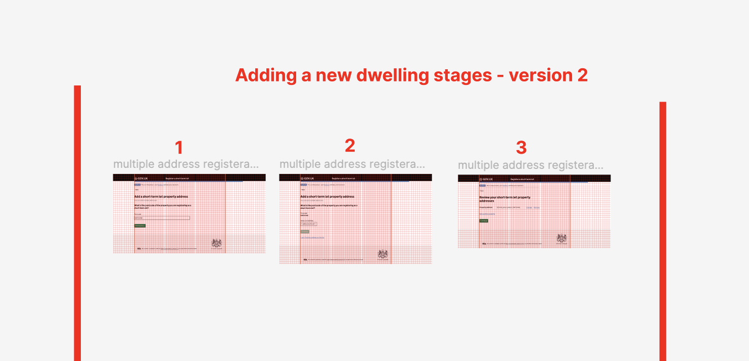
In round 2, participants were asked to test two different versions of the registration journey prototype. Each version allowed them to add multiple properties to their registration but in a different way;
-
Version 1 was sequential. Participants essentially completed the information for a single property in a linear manner by answering one question at a time (i.e. short-term rental property address must be completed first, then type of accommodation second, bedrooms and guests third, management agency details fourth, and compliance questions fifth.) Once that sequence of questions was completed for the first property, they could then add a second dwelling and follow the same sequence again.
-
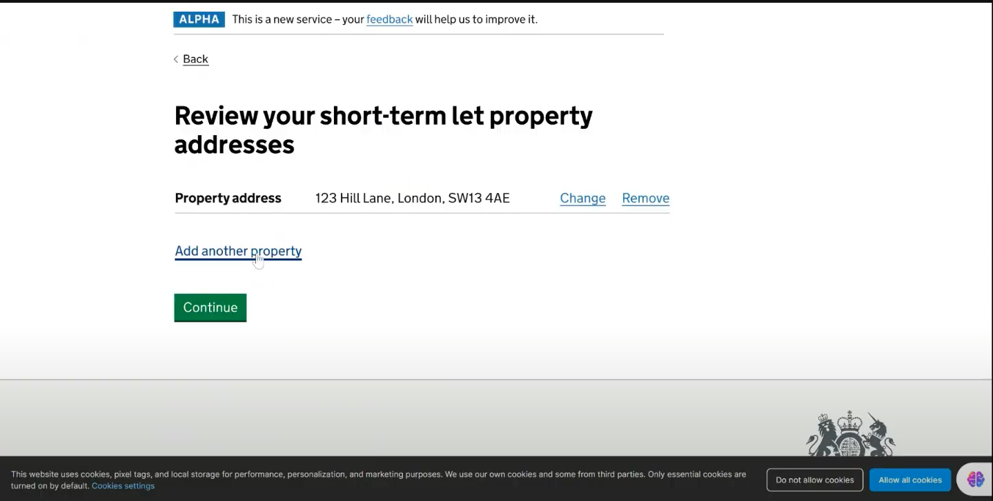
Version 2 was slightly more free-form. Participants would provide the addresses of all their short-term rental properties first. At this point they could then select different properties (in any order) and complete the information required via a task list (also in any order). In theory they could complete the whole application in any order they wished (for example they could complete the Furniture fire safety questions for ‘Property A’ first, and then complete the Accessibility questions for ‘Property B’ second, Bedrooms and guests questions for ‘Property C’ third etc.)
There is more detail about these different versions in the ‘Creating the different ‘Add another property’ prototypes’ section below. By testing two versions we hoped to understand which version operators of multiple short-term lets thought was easier to use. We asked them to compare the two versions they had seen and give us feedback on the usability. Round 3 was slightly different, as we were able to use the insights gathered in round 2 to settle on one version to test with users.
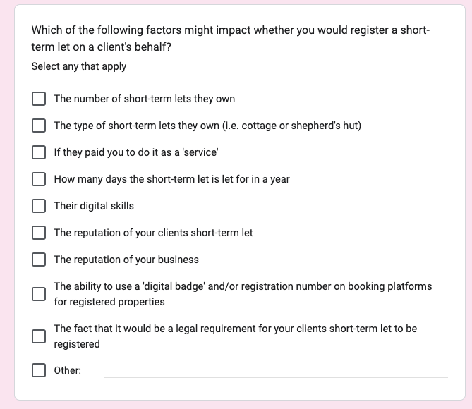
We also asked questions as part of our survey with Management Companies to try to understand whether managing clients who own multiple properties might have an impact on the willingness of management companies to play a role in the registration process. The specific question asked is shown below:
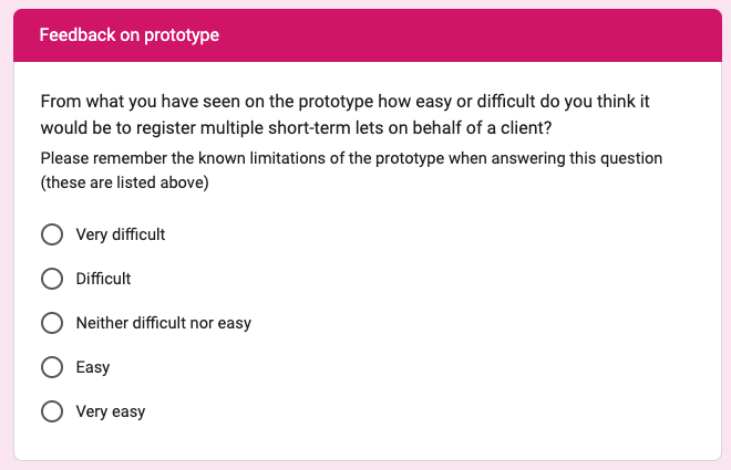
Additionally, we used the survey to test the scenario of registering multiple properties with management companies. They were given a scenario to follow using the prototype, and were then asked this follow-up question:
The findings from our usability testing sessions with operators and our survey of management companies can be found in the ‘Our findings’ section below.
Creating the different ‘Add another property’ prototypes
First iterations of ‘Add another property’ prototypes
To test the registration process for operators registering multiple short-term lets, we created two distinct prototypes and evaluated user preferences when adding additional properties.
Version 1: A GOV.UK Prototype Kit design, based on DCMS Pre-Discovery research.
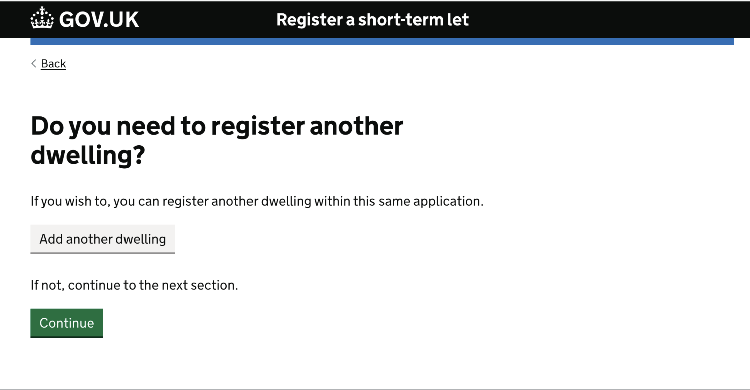
This design featured a linear, single-flow journey adhering to the Government Design System ‘one thing per page’ principle. Users would complete the details of one property at a time; after completion of the 12 stages/screens for that property (see below), they were prompted to add another dwelling and repeat the process.
Registering an additional dwelling screen:
Version 2: A Figma design created post-Discovery phase.
This design offered two flows at different stages of the process:
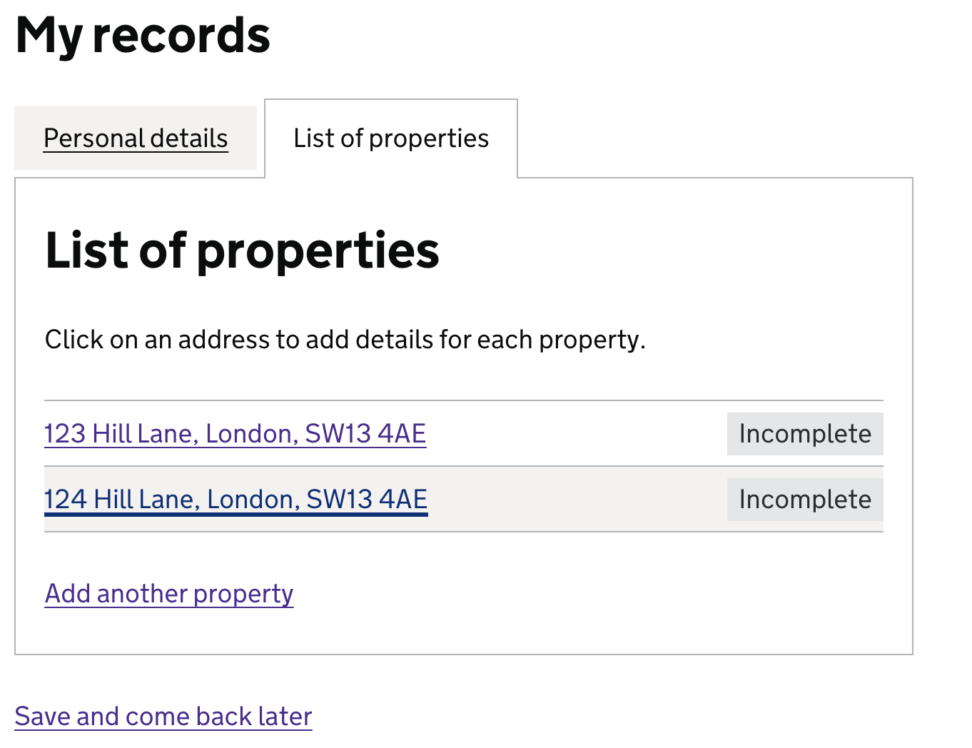
- Operators were able to add multiple properties into a summary list of properties, before adding the individual properties’ details in the order they wished. Status tags (e.g. ‘Incomplete’) based on Government Digital Service (GDS) standards were attached to each property, so the user could see the individual status of each property i.e. completed or still requiring information to be added.
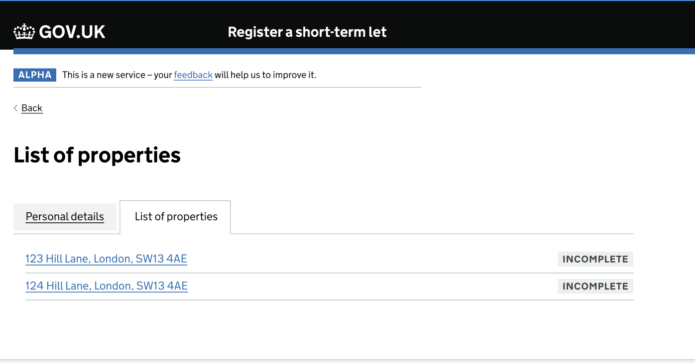
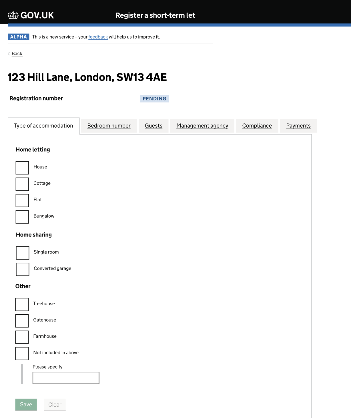
- We used a tabbed interface approach for adding and managing individual property details. Users saw the address of each property at a glance, and the tabs component then let them enter property details and navigate between different sections of content per property, displaying one section at a time. This reduced clicks, and we hoped would improve user experience by offering greater flexibility for entering details for different properties versus the linear approach in Version 1.
We further refined the Figma design by:
- Grouping related questions in the ‘personal details’ section
- Implementing a postcode lookup feature for address entry
The design decisions in Version 2 did not come directly from user testing sessions, but were made to try and streamline the registration process, reduce cognitive load, and improve overall user experience, especially for operators registering multiple short-term let properties. By testing these variations, we gained valuable insights to inform the next stage of design.
Screenshot displaying the reduced number of screens required for the user to complete before registering an additional dwelling:
Our findings
Findings from round 2 of usability testing with operators
All the findings detailed below are a result of thematic analysis which uncovers the most common patterns and trends that occurred when we conducted our testing of this assumption. This analysis does not provide any quantitative metrics, but the findings set out below are the most important and frequent themes that came as a result of testing this assumption.
1. Having to provide details of each short-term let separately would not be a reason why people would not register. However they want to do this in the most efficient way possible.
We learnt from our testing that having to register multiple properties would not put people off registering. They told us if they had to do this using the sequential flow of Version 1 (i.e. answering each question, in order, for one property at a time, to register their properties) they would do this. However, they believed that this would be time consuming, and they would prefer a way that would allow them to complete the registration of their multiple properties faster.
"I’m sure realistically I’d get it done (all of them) in half an hour"
“I’m thinking of that meme ‘oh god not another one’ (when having completed all the steps for a single property using Version 1 and then being asked to ‘Add another dwelling’)”
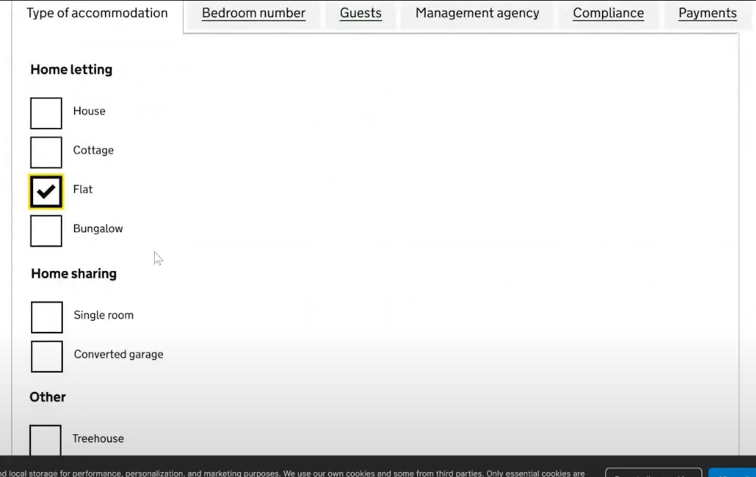
2. Participants preferred the ‘Version 2’ layout which allowed them to add multiple properties into a summary list, and to then navigate between the information asked about a single property in any order they wish.
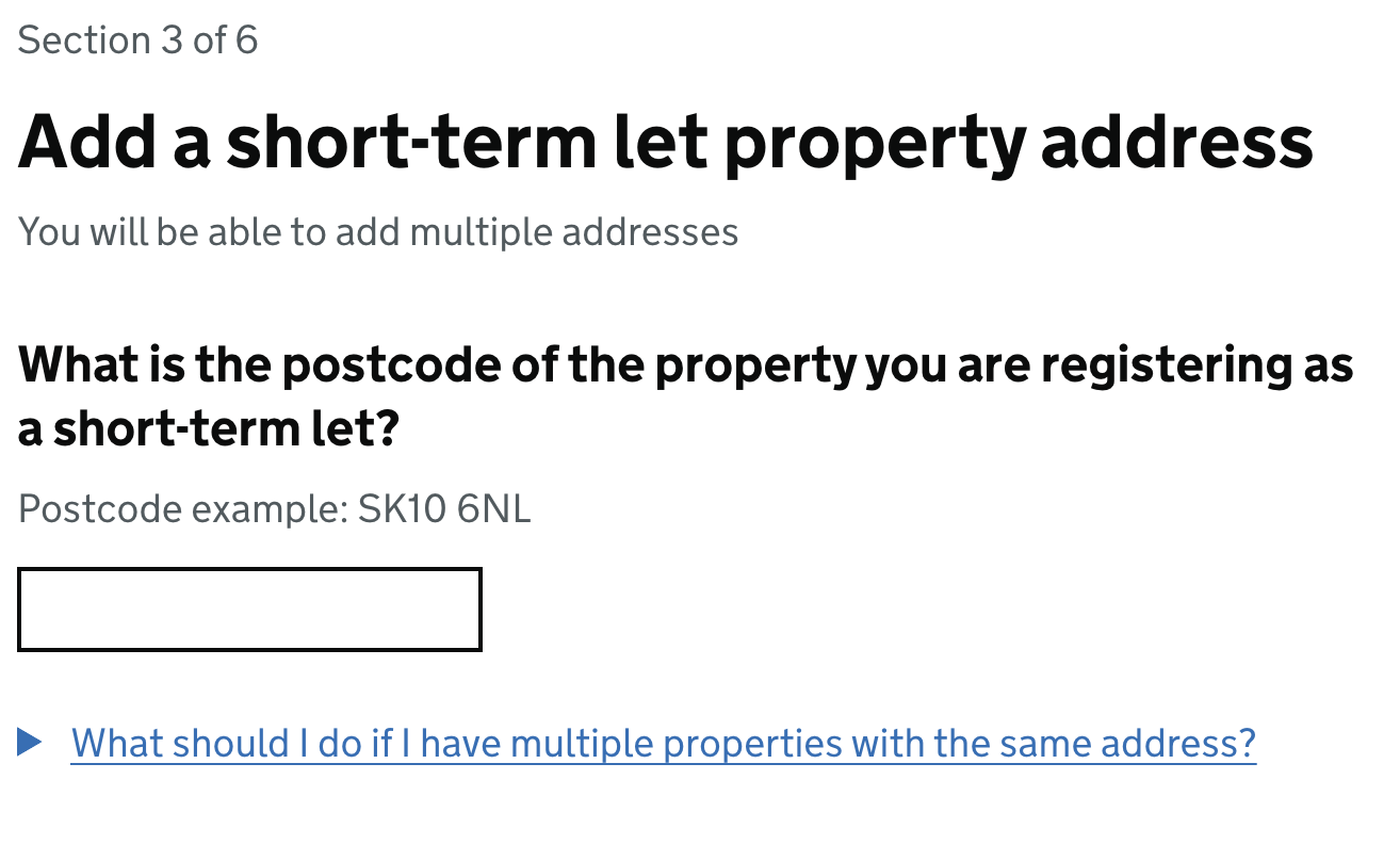
Of the three people that tried both versions of the prototype in round 2, all of them preferred Version 2. They stated that they believed it was the easier way for them to register their multiple properties. The screenshot below shows a participant navigating to the ‘Add another property’ link in Version 2 to show us how they would go about providing the details of a second property for their registration.
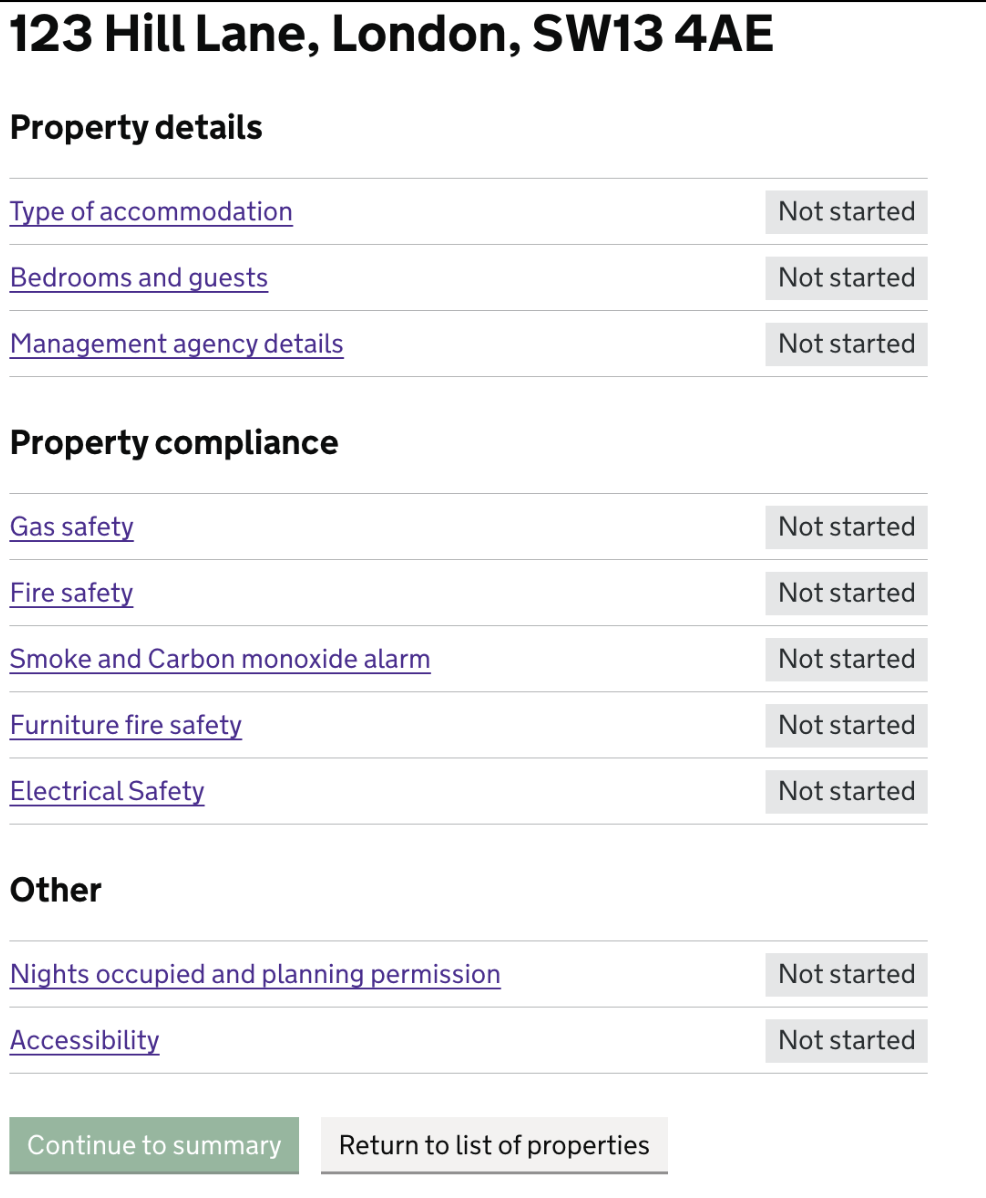
Participants also commented favourably on the tabbed layout, as this would allow them to provide the information that they had to hand on any single property more efficiently. The screenshot below shows how a participant was able to navigate through some different tabs in this version.
“(I) prefer this (‘Register a short-term let version 2’ Figma designs) because it feels like everything’s in one page”
“(The) details, properties tab - I like that better, nice and clear, easy to navigate, but get more info in. (It feels like a) quicker process.”
Although Version 2 was preferred in round 2, there were still several concerns, as well as comments on additional functionality participants expected to see:
- Participants wanted to be able to see their progress through registering a single property and also throughout the whole registration process.
- Participants wanted it to be made clearer that they would need to register multiple properties together in a single application.
- Participants who had multiple short-term lets at a single location (e.g. several shepherd’s huts in a single field or rooms within a house) were uncertain about exactly how they would register them using the prototype. One participant who was letting four rooms in a house thought they would simply just need to register the house and not the individual rooms.
- Participants wanted reassurances that they don’t have to complete the registration form all in one go, and that they could save their progress and return to the form to complete certain parts and submit it at a later date.
Resulting service design and prototype design suggestions:
- Provide more clarity on the progress that has been made with a registration, and where the registrant is in relation to finishing.
- Set expectations on whether users need to complete the application in one go, or whether they can save and return.
- Introduce a save and return functionality where users can complete the parts they are able to, and then return with any information which they do not immediately have to hand.
Design iterations for round 3 testing:
-
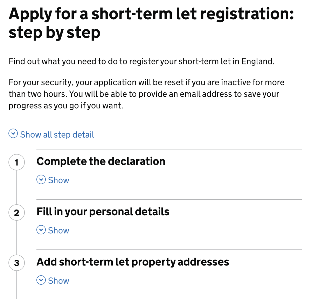
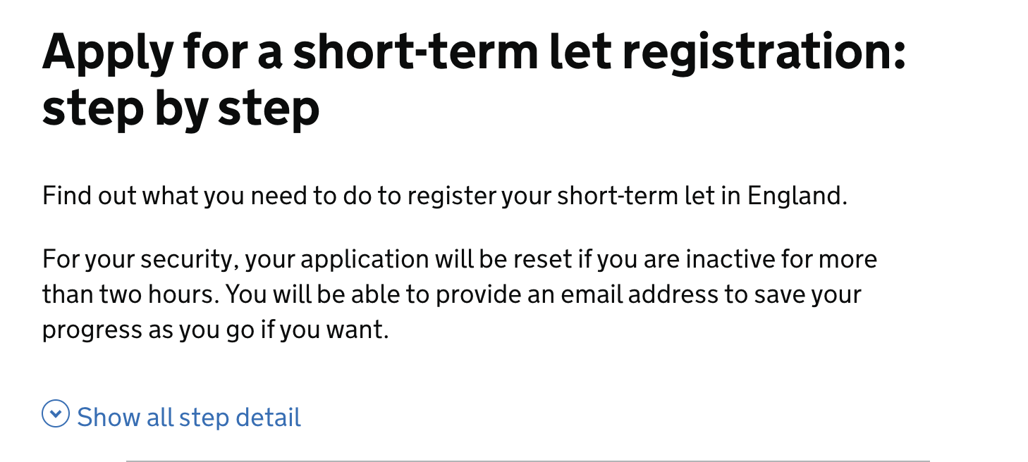
Seeing progress through the registration process: To address participants wanting to be able to see their progress through the process of registering a single property and also throughout the whole registration process, we added progress indicators at the top of each page (e.g. “Step 2 of 6”).
These steps link to a step-by-step overview which we also introduced at the start of the registration process, after the start page, so that users could understand the different steps in the process before starting to complete the registration. It included brief details about each step, including adding addresses for multiple properties at a certain point, to let users know they could register them at the same time.
We initially considered using a DVLA-style step-by-step component to show progress through the process, which would appear on the right hand side of every page and list every single step, but it cluttered the pages too much, especially in the tabbed sections where space was already limited.
-
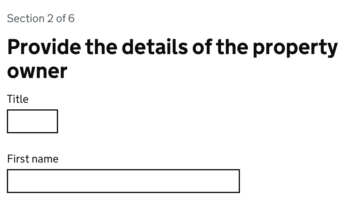
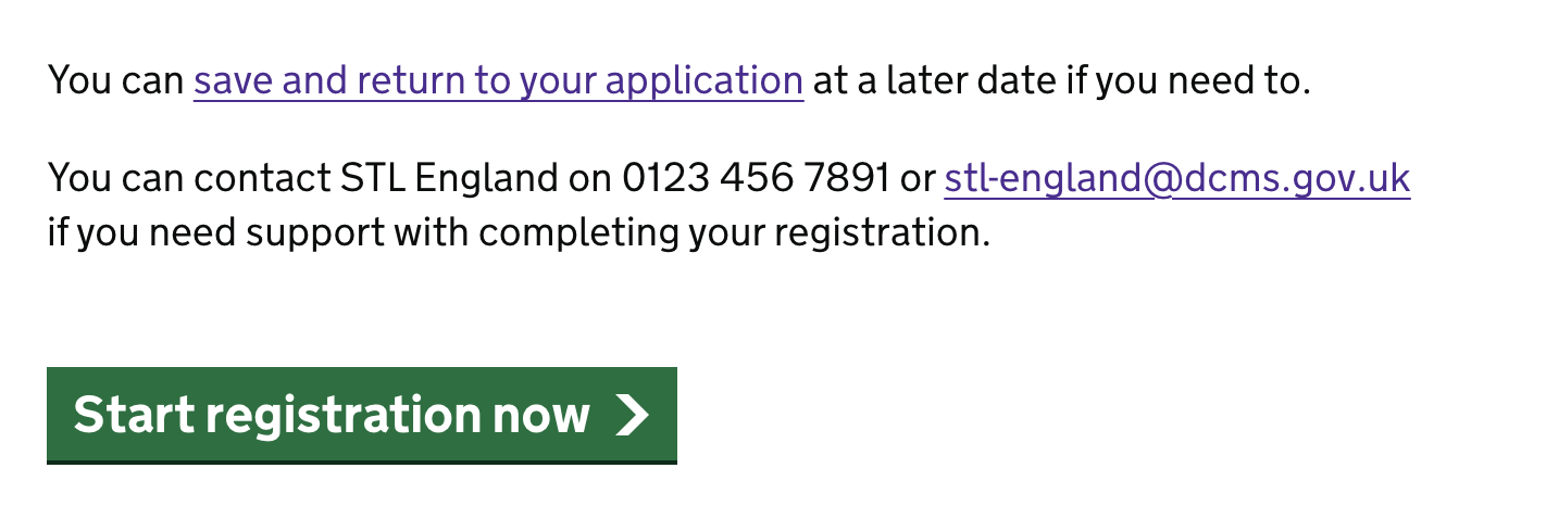
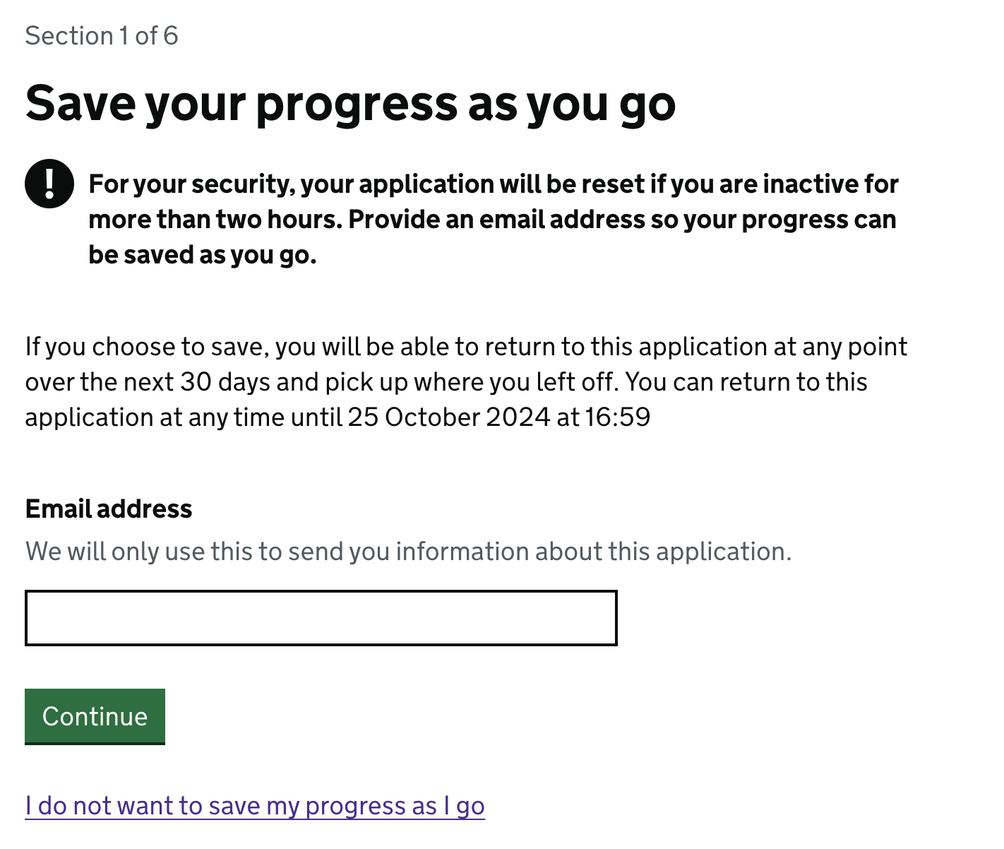
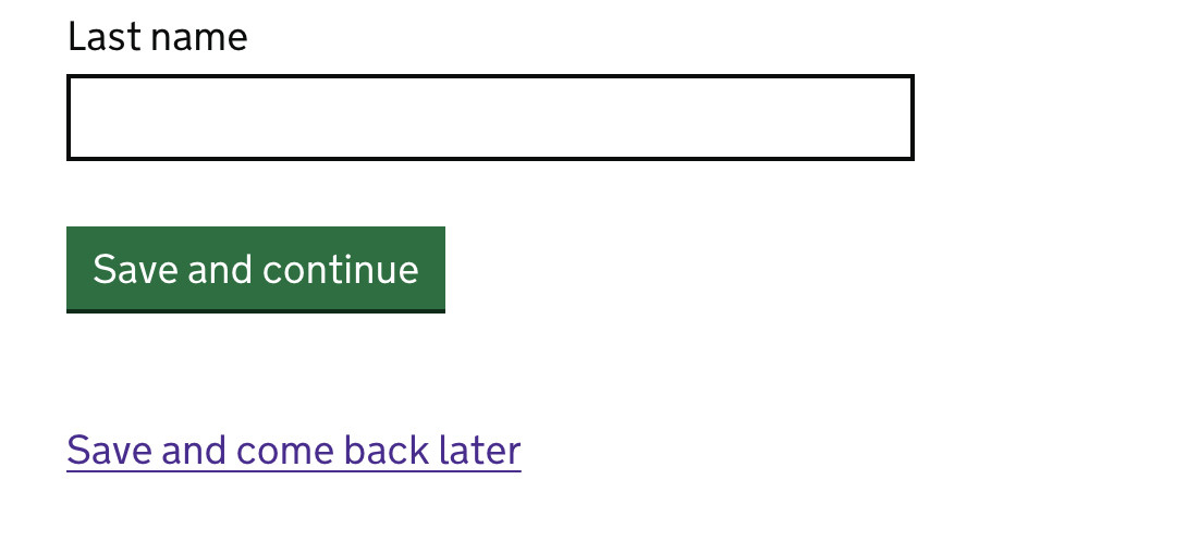
Completing the registration in more than one go: To address participants’ need for reassurance that they don’t have to complete the registration in one session, we added a link to the start page, informing users they can save and return later. This message was reinforced on the subsequent step-by-step page, where users are informed they can provide an email address to save their progress as they continue.
We also implemented a “save your progress as you go” screen, allowing users to enter an email address to enable them to return to their application within 30 days, inspired by the “Apply for a Blue Badge” government service. (We chose 30 days to give users time to acquire compliance certificates if they need them). Each subsequent page now has a “save and continue” button and a “save and come back later” link to further address this concern.
- Registering multiple properties at the same location: To address the uncertainty about how participants should register multiple short-term lets at the same location (e.g. several shepherd’s huts in a single field or rooms within a house), we added a details component with the text: “What should I do if I have multiple properties with the same address?” The goal was to inform participants that they would need to register each ‘unit’ (ie. individual property or room), rather than just the entire house.
-
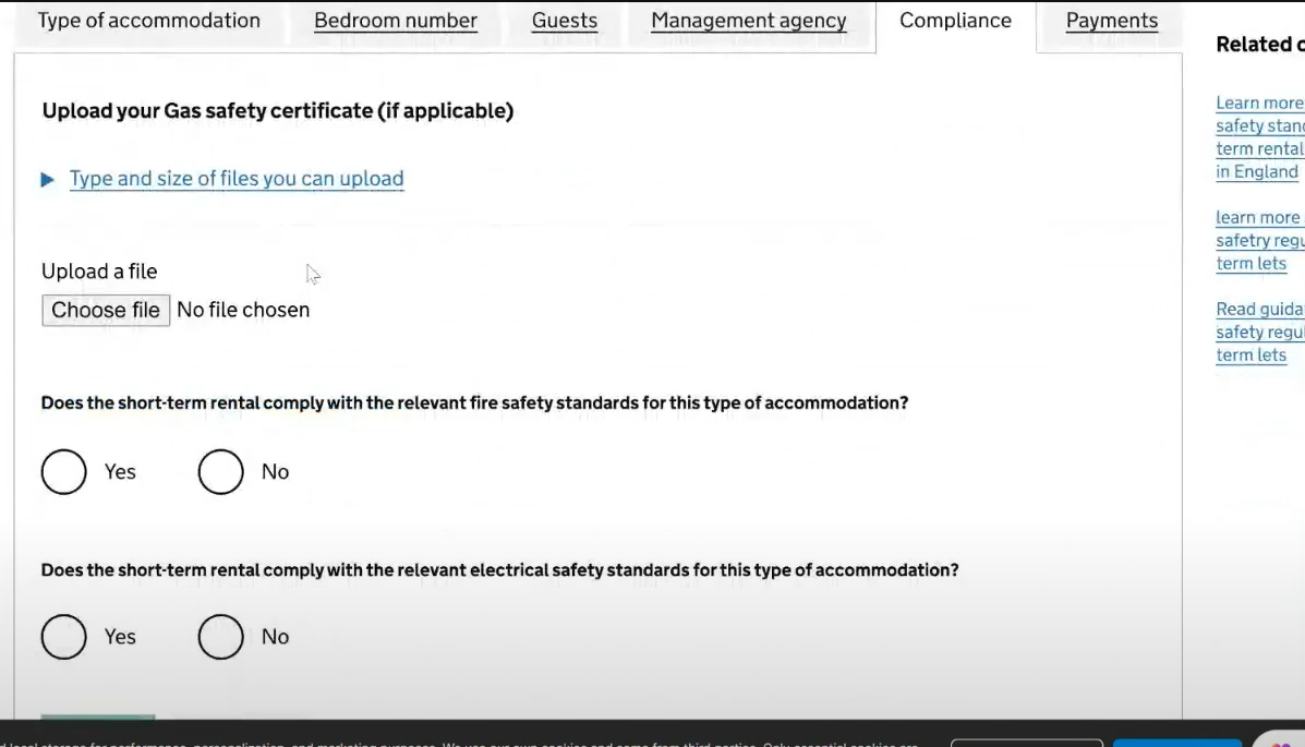
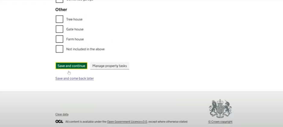
Adding Property Details: Following research findings from round 2, for round 3 of testing we also changed the Property Details section for each individual property from a tabbed component into a task list format, to reduce complexity for the user and also enable more sections and longer headings than the tabbed component would allow.
Users were now presented with a comprehensive checklist, asking them to provide information in three overall sections, each with more specific task sections within:
- Property details (type, bedrooms, guest capacity, management agency details (if applicable)
- Property compliance (gas safety, fire safety, smoke alarms)
- Other (nights occupied and planning permission; accessibility information)
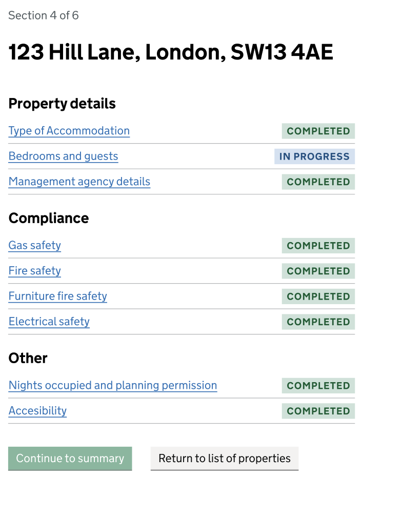
We implemented a progress tracker for each specific task section by using status tags (consistent with those used for the overall progress of adding property details). Initially, all task sections were tagged with a grey “Not started” label, and as users provided information, task section status tags updated to a blue “In progress” or a green “Completed” label.
Users could navigate through these sections at their own pace, and they had the option to:
- Continue adding information into each section
- Return to the main list of properties, if they wanted to add information for another property before completing the information for the current property
- Access the details summary page for each property at any time, even if sections were incomplete
This flexible system allows users to manage their application efficiently, completing task sections per property in one session, or completing task sections for different properties at different times depending on what information they had to hand and then returning later. The new vertical task list format offers more flexibility for content updates and better usability on both web and mobile platforms, giving users more control.
Our findings from round 3 of usability testing with operators
We used round 3 of our research to continue to test this assumption with any participants who owned more than one short-term let. This gave us an opportunity to test the iterations that had been made to the design.
All the findings detailed below are a result of thematic analysis which uncovers the most common patterns and trends that occurred when we conducted our testing of this assumption. This analysis does not provide any quantitative metrics, but the findings set out below are the most important and frequent themes that came as a result of testing this assumption.
1. The iterated ‘save and return’ pattern received positive feedback
Participants also realised that they would be able to return to elements they were not sure of at a later date due to the introduction of the ‘save and return’ pattern earlier on in the prototype flow.
2. The ‘task list’ format for adding property details was received positively
Participants were able to navigate around the task list layout intuitively. They typically worked through the task sections in order, using the ‘Continue’ button to move through them in a linear order.
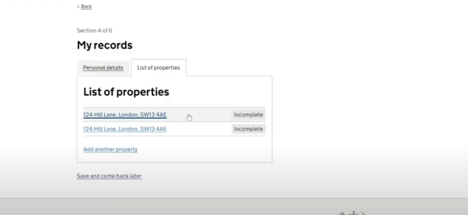
3. Some participants struggled to navigate off the ‘My records’ page.
Not all participants were clear on how they would progress from the ‘My records’ screen to add details per property (see screenshot below). Several did not realise that they needed to click on the property address to continue. One participant thought they had finished at this stage.
“I assume because it’s blue and underlined that it’s a link but it doesn’t say that I need to click on it to fill details”
Resulting service design and prototype design suggestions:
- Investigate the ways in which it can be made clearer to participants how they should move on from the ‘My records’ page; perhaps by including a ‘Continue’ call-to-action button which takes them to the task list page for the first property they need to provide details for.
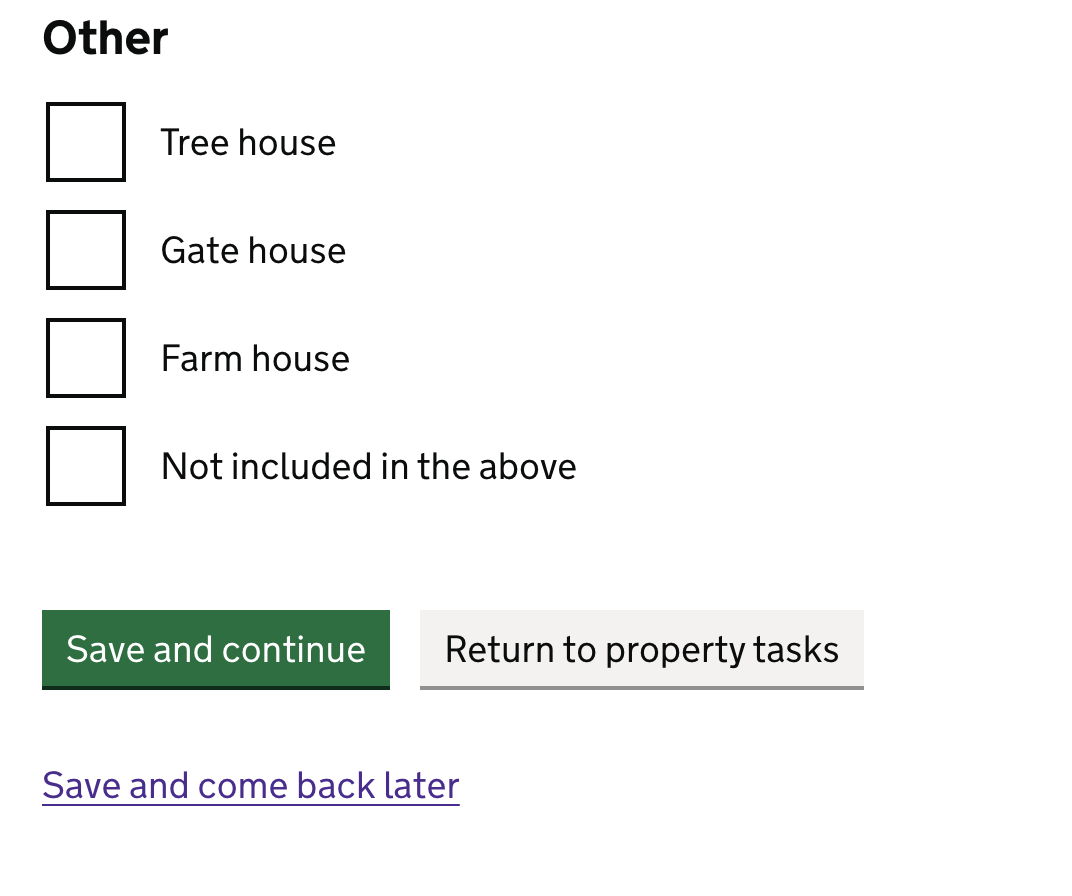
4. Some participants felt that the ‘Save and continue’ button in an individual task page did not behave as they expected it to.
They felt that ‘Save and continue’ should return them to the property task list, as opposed to being moved on the next task, which is not the purpose of this function in this prototype. This, coupled with the belief that the ‘Manage property tasks’ button was unclear, meant that some participants were clicking through more in hope than in certainty of what would happen next.
Resulting service design and prototype design suggestions:
- Review the call to action buttons at the bottom of each individual task page (particularly the ‘Manage my property tasks’ button), and consider where each takes the users.
Design iterations following round 3 testing:
- Clearer call-to-action on “My records” page: To address the issue from user testing where some participants were unclear on how to proceed from the “My Records” screen, we added hint text on the “List of Properties” page: “Click on an address to add details for each property.” The hint text component is usually grey, but we’ve made it black to ensure it stands out. If this remains unclear after further user research in Beta, we’ll explore other ways to guide users to the next section of the process.
- Clearer call-to-action buttons at bottom of task pages: To address the confusion around the “Save and continue” button and the unclear “Manage property tasks” button, we’ve updated the secondary button text from “Manage property tasks” to “Return to Property Tasks.” This change aims to eliminate confusion between the two buttons and their functionality. We plan to test this with users in Beta, and refine further if needed.
Findings from survey of Management Companies
Below is a summary of the findings that came from the Management Company survey that related to Assumption 7:
1. Those Management Companies that tested the prototype as part of the survey found the prototype easy to use.
As part of the Management Companies survey, those respondents who expressed that they would register short-term lets on their clients behalf were offered the chance to tested the prototype via a link. There were then some follow up questions asking how easy or difficult they thought it would be to register multiple short-term lets on behalf of a client using the prototype, 55.6% of respondents selected ‘easy’ compared to 11% who selected ‘Difficult’. Some of the corresponding free text responses were:
-
“The form is shorter than expected and we have the majority of information required to hand. Some of the personal information such as owners’ NI number may create a time lag… but if we are given advance warning of what is required we can easily collate this.”
-
“Fairly straightforward”
-
“It SEEMS fairly straightforward, but of course, it’s only a prototype, so have to wait and see.”
-
“Straightforward as long as you have the details”
-
“Seems straightforward to use”
This finding is positive, however it should be corroborated by conducting more qualitative usability testing with Management Companies. As we cannot be certain that respondents have considered the scenario they were asked (registering multiple properties) and are not merely giving general feedback on the prototype.
2. Theoretically, Management Companies are not concerned by the number of properties their client owns when it comes to supporting them to register
When asked which factors might impact whether they would register a short-term let on a client’s behalf, only 1/10 respondents selected ‘The number of short-term lets they own’ as a factor.
This finding seems to indicate that in principle those Management Companies who would register properties on their behalf of their clients do not see the number of short-term lets they own as a reason not to do that task. It should be noted however, that respondents were asked this question before they were shown a prototype of the registration journey, and their opinion could be different having seen the whole journey.
Some of the free text replies corroborated this:
-
“The number and type of properties is irrelevant - they should all be registered and we’ll be happy to do this for all of them"
-
“While the number of properties might influence the overall workload, it shouldn’t dictate whether or not to offer assistance. Providing comprehensive support to all clients, regardless of their portfolio size, demonstrates commitment and fosters trust.”
Going forward it would be interesting to understand whether this theory holds true when a Management Company was presented with a prototype of the full registration journey in a usability testing session i.e. when they have a complete view of the specific steps involved in registering a property. This is particularly important to explore further in Beta given that at least one Management Company expressed a need in a later survey comment, that they’d need to be able to upload multiple properties’ details via a CSV file, rather than in the way we’ve designed in the prototype.
Nevertheless, it shows a willingness of Management Companies to support their clients, and indicates that in principle, our assumption around having to register multiple properties separately deterring people from registering might not be true from the perspective of Management Companies.
3. There was some more general feedback on the prototype captured in the survey.
Respondents were also asked to give more open feedback on the prototype. A summary of some of the areas for improvement is as follows:
- Text relating to “90 nights” that was present on the start page confused some respondents; this definition did not appear to be something that was commonly known by all respondents.
- The ‘Registering on behalf of’ journey needs clarifying as respondents thought this was unclear, particularly as this is the role they (Management Companies) may have when using the service.
- There was some data requested in the prototype that is not what they typically hold about their clients (e.g. NI numbers and date of birth).
- Completing this for all their clients could be a very time consuming exercise.
- A feeling that the fee is too cheap.
- More areas of compliance could be asked for (i.e. proof of insurance).
Some comments relating to the points above:
- “With 200+ owners we need to provide the data in a csv file which will be quick and accurate. Manually entering each owner will take weeks if not months”
- “Should also ask for insurance certificate, business rates or council tax bill, chimney sweep (if applicable), managing agent and booking agent details.”
- “£45.00 is very cheap and I think you could charge more per annum.”